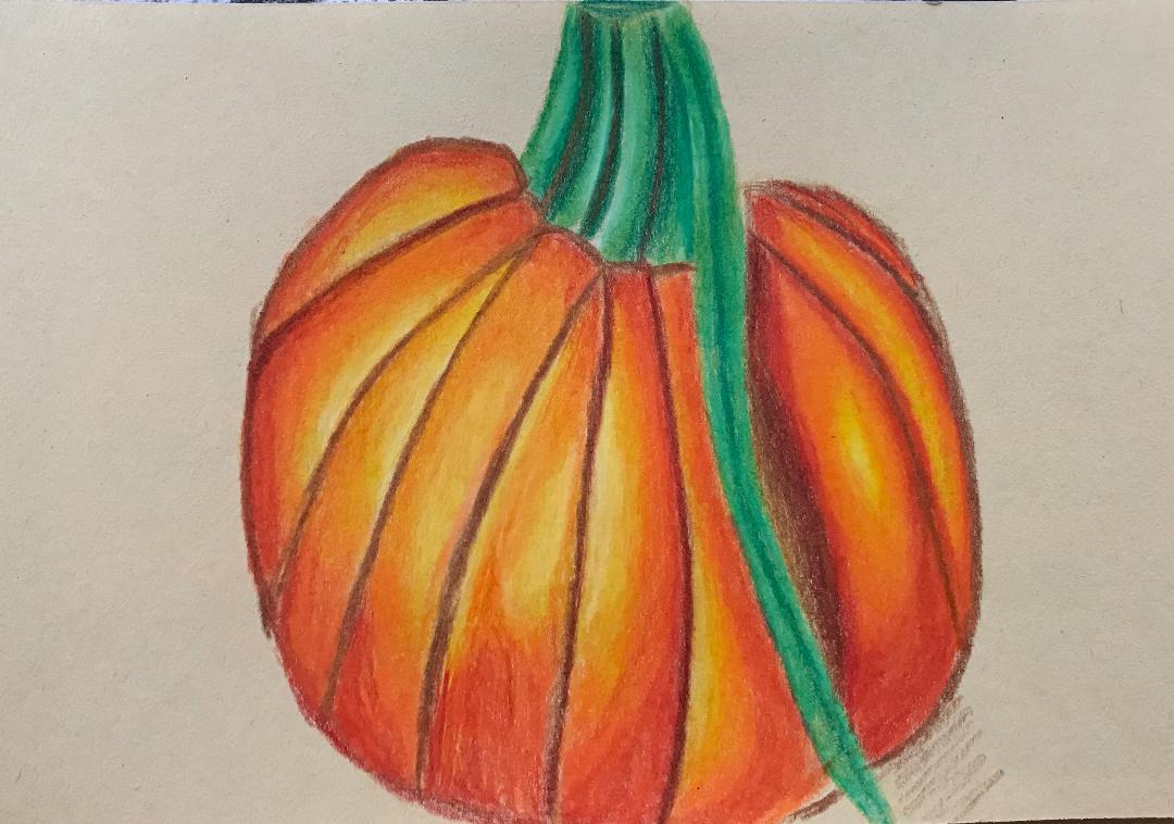
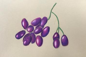
For these drawings we got print out pictures of each of the object and we had to draw with prisma color. This was our first activity using the prisma. They make the image a lot brighter and the colors are really easy to blend and I like that. You do have add a lot of layers and that takes awhile but in the end it looks good.
0 Comments
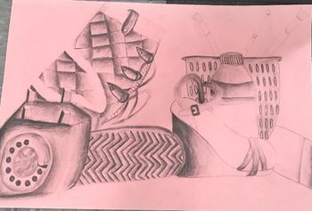
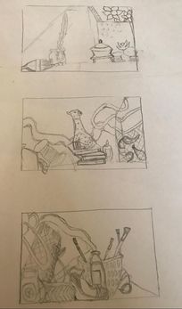 Practice sketches
 1) In my drawing I used a lot of value. I tried to add lots of different lights and dark's by adding shadows and highlights to my still life. Blending helps a lot with making that process successful. Adding more dark's and lights makes the object pop more.
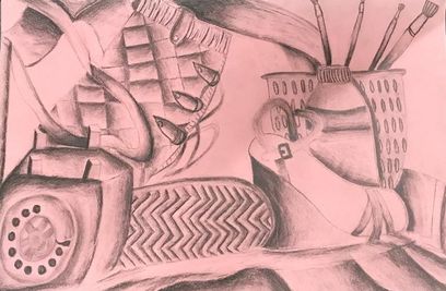
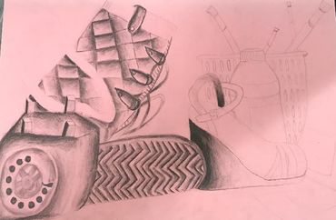
2) Most of the values and shadows are realistic but some i added in my drawing. I added a lot of value especially in my shoes and in the telephone. Value is very important in any drawing because it really shows the shapes indentations and shadows which those make the objects more realistic. 3) The lights were hitting off of my section I choose to draw at different angles because it was on the corner or the table. It still gave me a chance to add a good amount of my highlights and shadows. 4) The compositional sketches helped a lot with picking which section we wanted to draw and how to crop the image with adding everything in. 5) I feel like I got a lot better in the process and I also learned a lot with making it look more realistic. Also with adding as much detail as possible and with the values making them more exaggerated. By doing that it makes the shape pop more. 6) Some of my proportions are off but it was hard to get it the right size all the time by looking at it from a distance but i think my perspective was better. 7)I thought it was good placement and grouping of objects because any place that anyone chose to draw from had a good variety of different types of objects to draw with. 8) The center of interest in my drawing was probably the telephone because nothing was covering it and you could see it really well to make it stand out. 9) For this drawing I could have spent more time on this project with helping it look more realistic and fix some little things. For example my ribbon going through the top was really rushed so I didn't get much of a chance to show the curves of it and make the values make that pop. 10) The boot was really difficult for me because on most of the parts I wasn't sure how the best way to add value to it was. I ended up just making the creases darker and on the bottom of it I just used the design and made the lines darker to show it was deeper. 11) I learned from drawing a still life that it makes it a lot easier to make it look realistic because your not drawing from what you think the object looks like in your head your drawing from what you see. I also learned that it makes it easier with adding all the shadows and highlights because you just do it the way the light is shining on it.
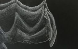
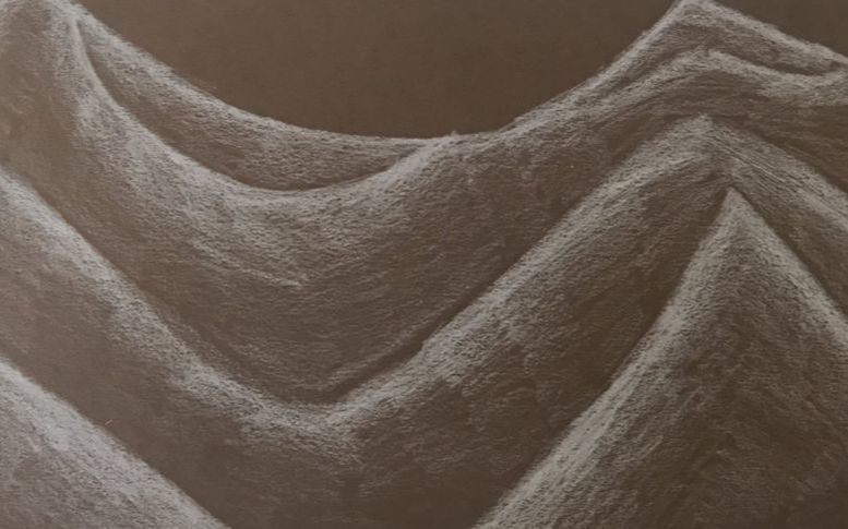
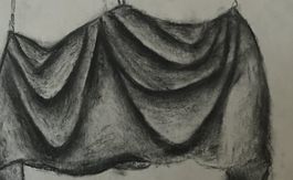
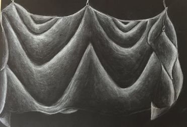 1) My fabric shows a wide range of values going from white to black. I used the black paper because I chose to use white charcoal for my final. Therefore my highlights are white and my shadows are black. I used this shading where are the wrinkles were in the fabric. It is important to have some black before you start your next highlight so it actually looks like a wrinkle or that parts are folding over the other part.
2) Practicing with value before doing this project was very helpful and made it a lot easier to be successful in this project. The practice also gave us an opportunity to try all the types such as black and white charcoal. Since we were able to do that we knew which one we felt would look the best for our final and which one worked best for us. Making a value chart with all these is also helpful because its like a warm up with the shadings. 3) The first half of my fabric I made a brighter white i did this to show that the lights were shining more on that side. Therefore I added more pressure. During my transitions though my pressure gets lighter and lighter because so does the color. To blend on my fabric i used a kneaded eraser and for the smaller sections i just used the eraser off my pencil. You have to slightly go over with the eraser or it will darker the color instead of blending. 4) It is important to think about the texture because it helps a lot with how thick you want to make your lines. Not only that its helps to know how far out all the creases go and to see where the light hits everywhere on it. The thicker it is the thicker you want to make you lines or not really thick just darker. The farther your creases go out is important because you need to see how big you want it to be and far apart you need it to be from the crease above and below it. 5) If I could recreate this piece I would zoom up more and pick a spot then drawing the whole fabric. I drawed the whole thing because I feel like it gives you more space to show more details and it actually look realistic. In my last practice with the white prisma I zoomed and It just looks like random lines but I could have spent more time on it making it look more realistic. I would also blend a little better I feel on some of my creases my transitions weren't as smooth. 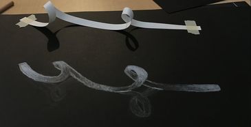 For this project we had to take a skinny piece of white paper and have two twists in it and tape the sides down. With this value project though we used white charcoal to add the shading and highlights. Since we were using the white charcoal we had to use the black paper. In my opinion it's hard to use value with the white pencils but it looks cool. We also did a white value chart before this project which really helped to see all the pressures and the transitions we need for this to be a success.
 This is a value chart practicing with white charcoal and white prisma color pencil. This helped to do before we used it in our other activities because it got us used to the way it blends and shades. This also helps us practice how much pressure we need to apply for each shade. Its always a smart idea to make a value chart for any utensil you use even if its a mini one on the side so you get a feel how it draws.
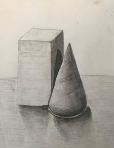 In this practice we put 3D shapes on our table and had the spotlights shine on them. We did this to get the shadow and the highlights and the darker areas of the shape. On our table we had a cone and a rectangular prism. we had to have their shadows overlap. So for our group we just put the cone slightly in front of the rectangular prism to have that shadow reflect on to it. This was good practice for the beginning of our value unit so we got a basic thing to draw and practice our value shadings.
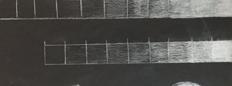
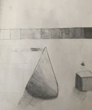 .Above you see my value chart. We did this to practice the transitions of the different values with our pencil. We could use this to base off of when we were doing our practice value drawings with the shapes. Doing a value chart with any material your about to draw with before you start helps you because you get the feel of how much pressure you need. It makes your transitions on your drawing a lot better with this practice. Below is my practice shape value and this was a good practice to see what it looks like or what it should look like before we did our main one.
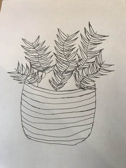 For our first week of homework we got assigned to contour draw a plant. I have a palm tree looking plant outside my house that I choose to draw. But it is much larger than this in real life so if I were to redo this homework activity I would fill up the page with the plant.
1) I have mostly fluid lines but sometimes it was hard to have it. For example its hard to have straight lines during this project and to not lift up your pen. Therefore you have to go over your old lines.
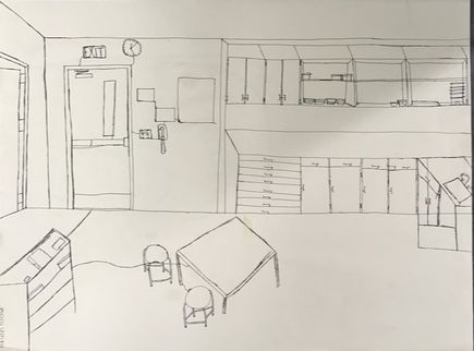
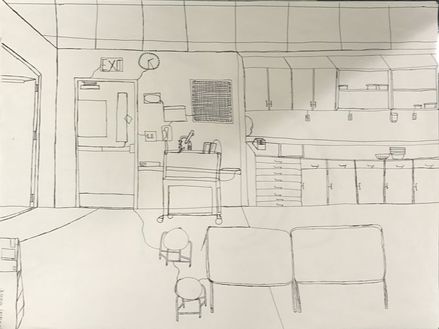
2) Having practice before doing this project with contour lines helped a lot. The practice got me on taking the lines slow and adding more detail. Practice also helped me being comfortable using pen doing this type of drawing. 3) Contour lining is different because contour is free hand drawing. what I mean by that is you just draw what you see and its not perfect. The way these drawings look good is how much detail you add into it and how realistic you can try to make it. 4) Your interpretation of line is essential in capturing the look of the room because it looks better when you get the objects your drawing close to its size. Also you need to have nice fluid lines in the drawing to add all the details you see in the room. The lines also can be better the more you practice so the lines are more even and realistic. 5) I learned from completing this drawing that the more detail and things you add in the room the better your drawing looks. If I could recreate this piece I would drawing more things I saw around the room. Also if I could redo this project I would worry less on how perfect everything looks and worry more on having those nice fluid lines. 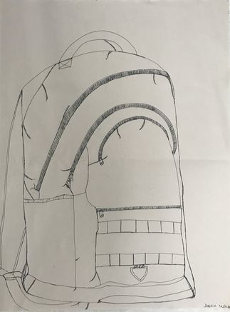 Above you see my book bag contour drawing. This contour drawing was on a larger sheet of paper, therefore we had to draw it larger and make it look life size. Something that challenged me in this drawing was the zipper it was really had to not lift up your pen and still have detail. Another thing that was hard for me is that it's difficult to get nice straight lines that even up with everything cause your just going with the flow of your hand. Also the book bag i was drawing was very stiff so it didn't have that many creases because of that it was harder to add more detail. I did however try add it as much as i could to make it look realistic.
|
AuthorWrite something about yourself. No need to be fancy, just an overview. Archives
January 2018
Categories |
 RSS Feed
Photo used under Creative Commons from mripp
