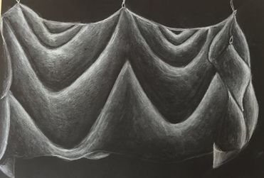
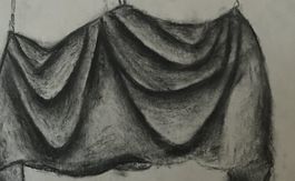
 1) My fabric shows a wide range of values going from white to black. I used the black paper because I chose to use white charcoal for my final. Therefore my highlights are white and my shadows are black. I used this shading where are the wrinkles were in the fabric. It is important to have some black before you start your next highlight so it actually looks like a wrinkle or that parts are folding over the other part.
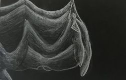
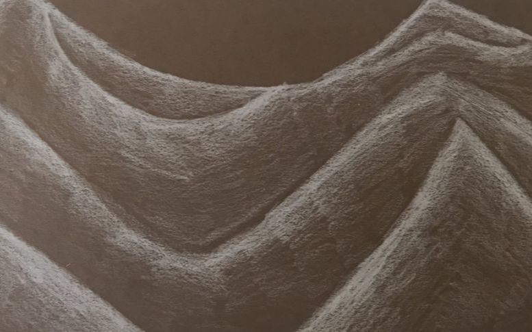
2) Practicing with value before doing this project was very helpful and made it a lot easier to be successful in this project. The practice also gave us an opportunity to try all the types such as black and white charcoal. Since we were able to do that we knew which one we felt would look the best for our final and which one worked best for us. Making a value chart with all these is also helpful because its like a warm up with the shadings. 3) The first half of my fabric I made a brighter white i did this to show that the lights were shining more on that side. Therefore I added more pressure. During my transitions though my pressure gets lighter and lighter because so does the color. To blend on my fabric i used a kneaded eraser and for the smaller sections i just used the eraser off my pencil. You have to slightly go over with the eraser or it will darker the color instead of blending. 4) It is important to think about the texture because it helps a lot with how thick you want to make your lines. Not only that its helps to know how far out all the creases go and to see where the light hits everywhere on it. The thicker it is the thicker you want to make you lines or not really thick just darker. The farther your creases go out is important because you need to see how big you want it to be and far apart you need it to be from the crease above and below it. 5) If I could recreate this piece I would zoom up more and pick a spot then drawing the whole fabric. I drawed the whole thing because I feel like it gives you more space to show more details and it actually look realistic. In my last practice with the white prisma I zoomed and It just looks like random lines but I could have spent more time on it making it look more realistic. I would also blend a little better I feel on some of my creases my transitions weren't as smooth.
0 Comments
Leave a Reply. |
AuthorWrite something about yourself. No need to be fancy, just an overview. Archives
January 2018
Categories |
 RSS Feed
Photo used under Creative Commons from mripp
