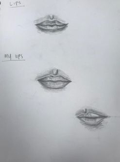
 This is my practice of the lips. Something I didn't know before this was the line in the middle of your lip isn't straight it's kinda the same shape as the top of the lip. The key to drawing lips is having good value and leaving some highlights. The third one I drew was drawing the lips from a different angle and that was not as easy.
0 Comments
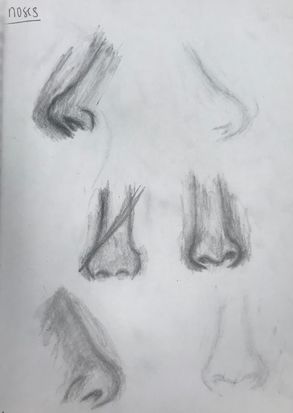 This is our practice for noses. We had to draw 3 different angles/views of the nose. I chose both sides and then one in front. Noses are very difficult to draw I feel like it's the hardest facial feature to draw. This is my opinion because it's really hard to get it to look realistic.
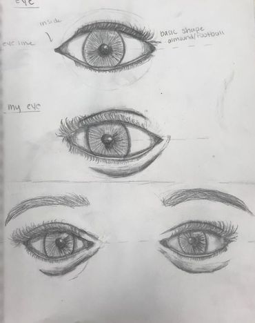 This is my practice for drawing eyes realistically. I think the hardest part in drawing the eyes is the shape because when drawing someone you need the right shape cause everyone's is different. Also it's really important to draw the eyeline first so you can get your eyes symmetrical.
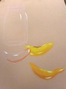
1) I feel my highlights are very bright and strong. My shadows could have popped more they kinda got mixed with the background. My background was also rushed i could have made it better.
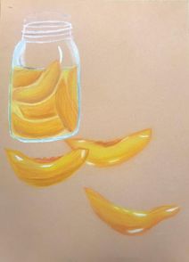
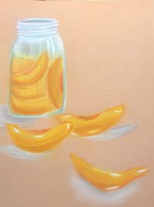
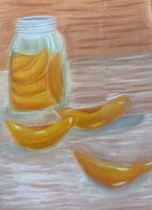
3)For the peaches I had lots of warm bright colors for them to really stand out. I also added some brown with it and it blended very well together. I added blues and little bit of grey to the glass to add some shadows. 4)I created contrast from making the background darker so that the jar and the peaches stand out. I also made my highlights very strong and bright white to contrast from the rest of the peach. 5)For my background I made lines above the color so it shows some texture. I made the shadows lower than the peach so it shows that the peach is standing up and part of it is higher. I should have added more shadows on the jar because it has to much white and you can't see where the light is hitting. 6)I choose brown and white for my background color because they kinda go with the colors of the main parts of it. They don't mix too much that they take away from the peaches in the jars. 7)It was nice having practice with the clay pastel before I did this project. It helped show me that the shadow works very well when you mix grey and white. Also I picked clay over prisma for this project because it gives more of a realistic color to it and not so bright. I also liked how easier it is to blend clay than prisma to add more different colors in. 8)I could have drawn something in my background instead of just colors. I also wish i made my glass look more realistic by not adding so much white and maybe adding some other colors to show the opacity. |
AuthorWrite something about yourself. No need to be fancy, just an overview. Archives
January 2018
Categories |
 RSS Feed
Photo used under Creative Commons from mripp
